VOLUME 3: Table of Contents
TEACHING ISSUES AND EXPERIMENTS IN ECOLOGY
TEACHING
ALL VOLUMES
SUBMIT WORK
SEARCH

STUDENT INSTRUCTIONS
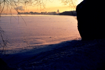
Lake Mendota photgraphed from University Bay by Dale Robertson on December 12, 1985.
Introduction
It is clear that global warming is taking place. Global temperatures have increased by about 1 degree Fahrenheit during the last century, most likely the result of greenhouse gases such as carbon dioxide from burning of gasoline, oil, and coal. (How do these gases cause an increase in earths temperature?) One degree may not seem like a lot, but realize that this is an average change; in some places the increase is greater. For instance, in many locations in North America the hottest days on record happened in the late 1990s.
There are many environmental consequences of warmer temperatures, some unexpected. In Alaska, for instance, warmer weather allows the spruce bark beetle to complete its normally two-year life cycle in just one year; the result is millions of acres of spruce forest killed by the beetle. As another example, mosquitoes carrying diseases have spread to areas where they have never before been recorded.
One challenge to our understanding of environmental effects due to global warming is lack of data collected over long periods of time. The data from lakes in Wisconsin that you will work with is very unusual because it spans 150 years.
Plotting the lake ice records for Lake Mendota
The data you will work with are 1) the duration of ice cover, 2) dates of spring "ice-off" (the break-up of winter ice cover) and 3) dates of "ice-on" for Wisconsin's Lake Mendota, which is part of the North Temperate Lakes Long-Term Ecological Research site. Each of these measures may provide different types of evidence related to global change.
In groups of 3-5 students, discuss the three measures from the data sets and brainstorm what evidence each of these may provide related to global change. For example, ice-off data are especially useful for assessing long-term trends since they integrate air temperature over many days. Therefore this single data point actually expresses the cumulative effects of local weather conditions over the winter season.
- Examine the spreadsheet given to you. This spreadsheet includes the original ice data collected at lakes Mendota over a 150-year period.
- Look at the headings at the top of the columns to make sure you understand each one.
- Take a look at the first row of data, for the winter of 1855-56. In this winter, the ice froze on December 18 and melted on April 14. So the "Ice Duration" was from Dec. 18 to April 14, a total of 118 days.
- Notice that, in addition to being expressed as dates, "Ice On" and "Ice Off" are also expressed as numerals, the number of days since January 1. For example, look in the sixth column. The "Ice Off (Day of Year)" for 1855 is 105 (January 1, 1856 to April 14, 1856). Finally, notice that the "Ice On" date for some years (e.g., 1931) is greater than 365. That's because the ice on the lake did not form until after the end of the year (e.g., January 31).
- Your teacher will either tell you, or you will decide as a class, which data you will graph (ice-on, ice-off, or ice duration). Which do you think will give you the most useful information or the clearest evidence of a trend? What is your hypothesis for this data set what do you expect to find? Make a sketch of the pattern you predict to see.
- For each graph you create, use the x-axis to indicate years.
- Before making your graphs, the entire class needs to agree on a labeling system and scale for the graphs. At the end of this activity, you will be merging your graphs with other groups' graphs. It is essential that you label the values on the axes in exactly the same way and have the same scale on all the graphs.
- What should be the lowest value on the y-axis? What should be the highest value? What are the units? You will need to make a scale that can incorporate the highest and lowest values for the entire 150-year data set.
- Each group will work with 20 years of data; your teacher will tell you which 20 years your group will graph. Graph your 20 years of data. For each graph, answer the following questions:
- Is there much variability from year to year, or only a little?
- Do you see a trend? As time elapses, does the value tend to increase, decrease, fluctuate, or stay the same?
- Pair up with one other group and compare your results. Did you reach the same or different conclusions based on your data set?
- Now, combine the graphs from the entire class. Tape them together so they form a continuous graph. Answer the following question as well as questions you come up with on your own. Do you see a trend with the longer-term data set?
- If you graphed ice duration, answer the following questions. (You may want to adapt these questions for ice formation and ice-off data, using the numeric value for date.)
- What is the average ice duration in your 20-year data set?
- How does this compare to the average ice duration over 150 years?
- What is the longest period of ice duration in your 20-year data set?
- What is the shortest period of ice duration in your 20-year data set?
- What are the longest and shortest periods of ice duration in the entire data set?
- In what years do they occur?
- On your graph, draw a line to indicate average ice duration. Within your short-term data set, how many years have longer-than-average ice duration? How many years have shorter-than-average ice duration? Compare these values among all of the groups. Do you see a trend in years with longer or shorter than average ice duration over time?
- To conclude the activity, think about the implications of your data analysis. You should answer the following questions as well as any questions the class generates.
Questions for Discussion of Implications
- To what extent do data on ice cover provide evidence for global change?
- To what extent do data on ice cover not provide evidence for global change?
- In regard to these two questions, which evidence for global change or lack of evidence for global change is stronger? Why?
- What other kinds of data do you feel you need to make your arguments stronger? Provide specific examples.
- How might the observed trends in ice cover influence the ecology of lakes? What changes might you predict in biological diversity, productivity, water quality, etc? Why?
<top>